
The ingredients 🍉
The brief
Design an onboarding experience that educates users not only about what the software does but about the benefits of becoming a truly customer-focussed company.
Time and team
- 2.5 weeks
- Annelise Nelson
- Ben Luby
- Cuong Lu
- Niki Morariu
My role
As well as working on all of the deliverables with the team, I wrote out our interview and test scripts. I also carried out additional research into onboarding best practices.
Skills and tools
- Competitive analysis
- Recruitment survey
- Persona design
- High fidelity prototype
- Client pitch presentation
The quest 🌴
Discovery

NomNom 💛 customer feedback
NomNom Insights are a great software as a service startup whose mission is to change the way product decisions are made. By allowing companies to aggregate, organise and categorise all customer feedback in one place NomNom helps product teams spend less time on spreadsheets and emails and more time understanding customer's motivations. How cool is that?!

The importance of making a good impression
The brief was to redesign the on-boarding process to make it easier and more enjoyable for the user and less manual for NomNom. Currently onboarding is done by NomNom's CEO and is a very long process, making it difficult for NomNom to scale as a business. Making a great first impression would get users engaged quickly and turn them into NomNom's champions, allowing them to grow and achieving their mission.
The initial scope gave us lots of room to explore the user onboarding experience. Given our 2 week time constraint and our client’s imminent public launch we decided to focus on the first time in-app experience only.
User interviews
We sent out a recruitment survey through our social media networks and directly approached people who represented the current target market for NomNom, including; product managers, product designers, UX designers, heads of business development and CEO’s of small to medium sized software companies. I wrote an interview script that we then used to conducted 30-60 minute interviews with 15 potential users.

Interviewing CEOs of tech startups

Analysing interview results
Analysing our user interview data through affinity mapping, revealed that universally, the first thing people want to see upon using a new product is the value that the product would give them. From the interviews we learned that people wanted to be shown value rather than be told; that they are an independent bunch and need flexibility in how much and how often they get support; and that they want an onboarding experience to be a fun and rewarding learning process. Additional learnings were that our target users need:
- To see the benefits over features
- To learn by doing with dummy data
- To see patterns/insights in data
- Something that will save them time
Business Research
A competitive analysis focusing on data collation sites and product management sites helped us to understand the onboarding landscape for similar products. We found some really excellent examples and had an understanding of the minimum requirement that we would have to achieve for NomNom – To gain several minutes of user attention, we must clearly communicate NomNom's value proposition within 10 seconds! We also researched best practices that interestingly resonated with what our user interviews had told us; onboarding should be fun, simple, show value early and highlight benefits over features.
Vision and hypothesis
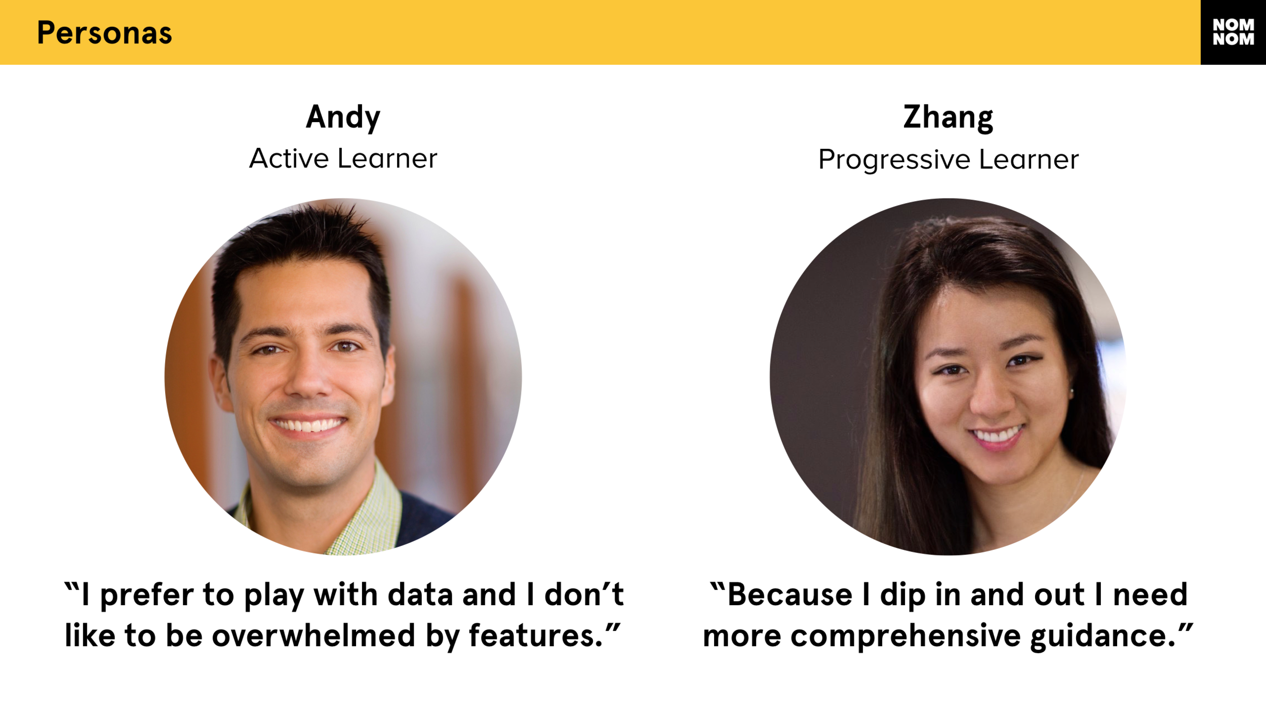
Our personas, Andy and Zhang
With the key insights from user research we created personas to help us define our designs. Andy the “active learner” was our primary person and Zhang, the “progressive learner” was our secondary persona. We chose Andy as our main persona as his needs aligned with the business preference to encourage early integration of data sources. We did however decide that we needed to design a solution that would also work for Zhang since, post launch, roughly half of the users coming to the NomNom site would demonstrate behaviours like hers. These personas help with our feature prioritisation, defining the minimum requirements for our onboarding solution for NomNom.
Experience mapping, scenarios and user flows helped to understand the tasks required, behaviours, attitudes, and pain points of our personas. Examining these helped us decide that the NomNom dashboard, the integration screen and the powerful search functionality should be included in our onboarding.

Experience mapping the user journey without onboarding

Exploring the future state user flow
Design Principles and hypothesis
To wrap up our discovery phase we brought together our key learnings about user and business needs and came up with our design principles

Keeping sight of our design principles and hypothesis
- Users should feel flexibility but never abandonment
- The support experience should be subtle but memorable
- Value should be “shown” and not “told”
- Voice should be fun but not funny
Our hypothesis for the design phase was as follows:
"We believe that providing sample data where users can learn by doing and therefore see the value of the product for themselves, will result in better understanding of how the product works. We will know this to be true with an increase in customer feedback sources being integrated."
All our design decisions were checked back against our personas, our design principles and our hypothesis.
Design
Design Studio
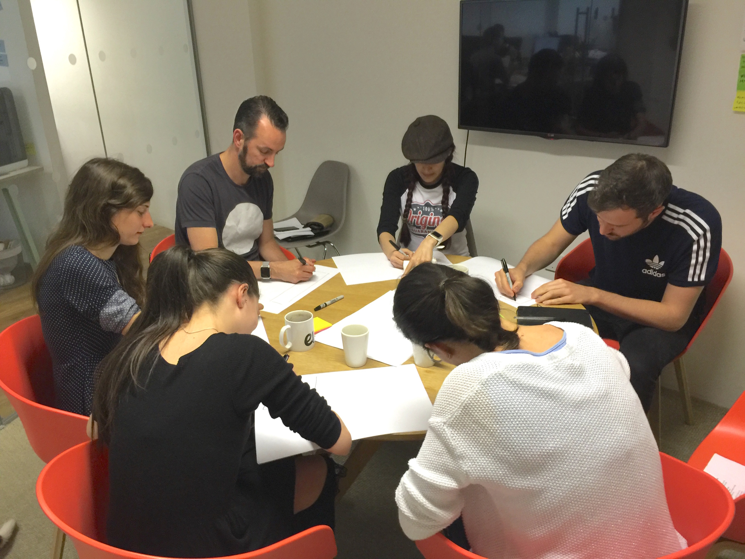
Design studio with NomNom stakeholders
To kick off design we held a design studio session with the NomNom team. A design studio is a collaborative design method focused on the processes of illuminate, sketch, present, critique and iterate. It's a fast-paced exercise to arrive at several solid design solutions together as a team and is a great way of harnessing multiple ideas from different view-points. In our design studio we explored two design challenges: 1) how an onboarding experience would flow considering the needs of our user and, 2) how we could improve the design of the integration page to provide my integration information and feedback.This helped us arrive at the key interfaces which we then developed as a paper prototype.

Testing with paper prototypes
Sketching and Prototyping
As a team, we felt that our users needed a friendly welcome when first entering the NomNom site, so we introduced a welcome screen. Focusing on the need for flexibility we decided to test how users responded when given a choice (to either integrate immediately or take a tour) on that welcome screen. We created paper prototypes to test this as well as our ideas for the integration page. Because we weren’t redesigning the UI of the product we moved to Sketch for mid fidelity wireframing quite early. By moving to higher fidelity prototypes early we hoped to gather richer feedback from our testing.
Testing
I wrote a test script for our user testing and we ran 5 rounds of tests and iterations before finishing with a high fidelity prototype in keeping with the existing visual design of NomNom. Usability testing was conducted either in person or remotely using Invision’s Liveshare function, Skype or Quicktime Player.

Remote testing
Insights and Iterations
Key lessons learnt from our testing were threefold; we knew that we had many user behaviours and business needs to balance but we hadn't quite got them right to begin with. The first lesson we learnt was that the order of screens mattered. Our initial onboarding flow had gone from the dashboard, to the integration screen, to the search screen. But, by taking users to integration too early, we'd created confusion about what was real data and what was not.
“This flow feels very bizarre… I’m feeling very confused right now because I don’t know if this is showing me my data or not.”

User testing

And more user testing!
The second thing we learnt was that we needed to be confident in the approach and the degree of guidance that we were giving people. We needed to be bold with our breadcrumbs and navigation through the onboarding experience. We'd tried to cater to too many different users’ needs and the businesses needs so didn’t commit to one form of onboarding and ended up giving users too much choice and too little guidance. It was a mixture of onboarding styles and preferences that became a frankenstein! The perceived value of NomNom went down due to an overwhelming and unconventional experience.
“It has to do one thing and one thing really well. It feels like a bit of a frankenstein right now.”
“What NomNom gives you out of the box is great. But once you start customising it with your own Smart Tags it becomes a very valuable tool.
”
Testing with existing NomNom users revealed a powerful feature of the product that they felt we needed to include in our onboarding to show new users value in the product. This was the smart tags, so we decided to include that in our onboarding. This was the third lesson we learnt. The smart tags had not previously been included as they hadn't been called out in our design studio as a kew feature to include.

Taking a holistic view of our testing feedback
By our 4th round of testing and iteration we felt we were going around in circles and needed to take stock of our situation. Up until that point, we’d been iterating based on the latest round of feedback but what we did now was to take a step back and look at the feedback from all rounds to have a holistic view of what had and hadn’t worked. We had a discussion over these issues and pivoted our design. The outcome of our discussion was as follows:
- We stuck to 3 step tour that had worked well through testing
- Each step equated to one overlay and one screen
- Only one benefit/feature would be called out per screen
- We removed integration from the tour
The refinement 🌺

Final testing
We tested our final prototype and found user’s confidence in the product increased, as well as the understanding of the value. They knew why they should integrate their own data and how to do it. Testers were responding positively to the product saying that they could imagine using the product in their workplace.

The welcome screen
As a team we'd succeeded in providing users like Andy and Zhang with more education about NomNom and how it could help them see all their customer feedback in one place; redesigned the integration page to make it more intuitive to integrate data sources; and provided NomNom with much-needed user testing data to make a scaleable onboarding experience.
We delivered a 20 minute presentation to pitch our designs that would meet both the user needs and business needs. This was presented to the whole team of NomNom. We covered our research, designs and insights from user testing. Our research and designs were very well received by the NomNom team who, upon receiving our design specification document, are now looking to implement a similar solution in the next few months! Win! :)

Presenting our design back to Nom Nom
The evolution 🍍
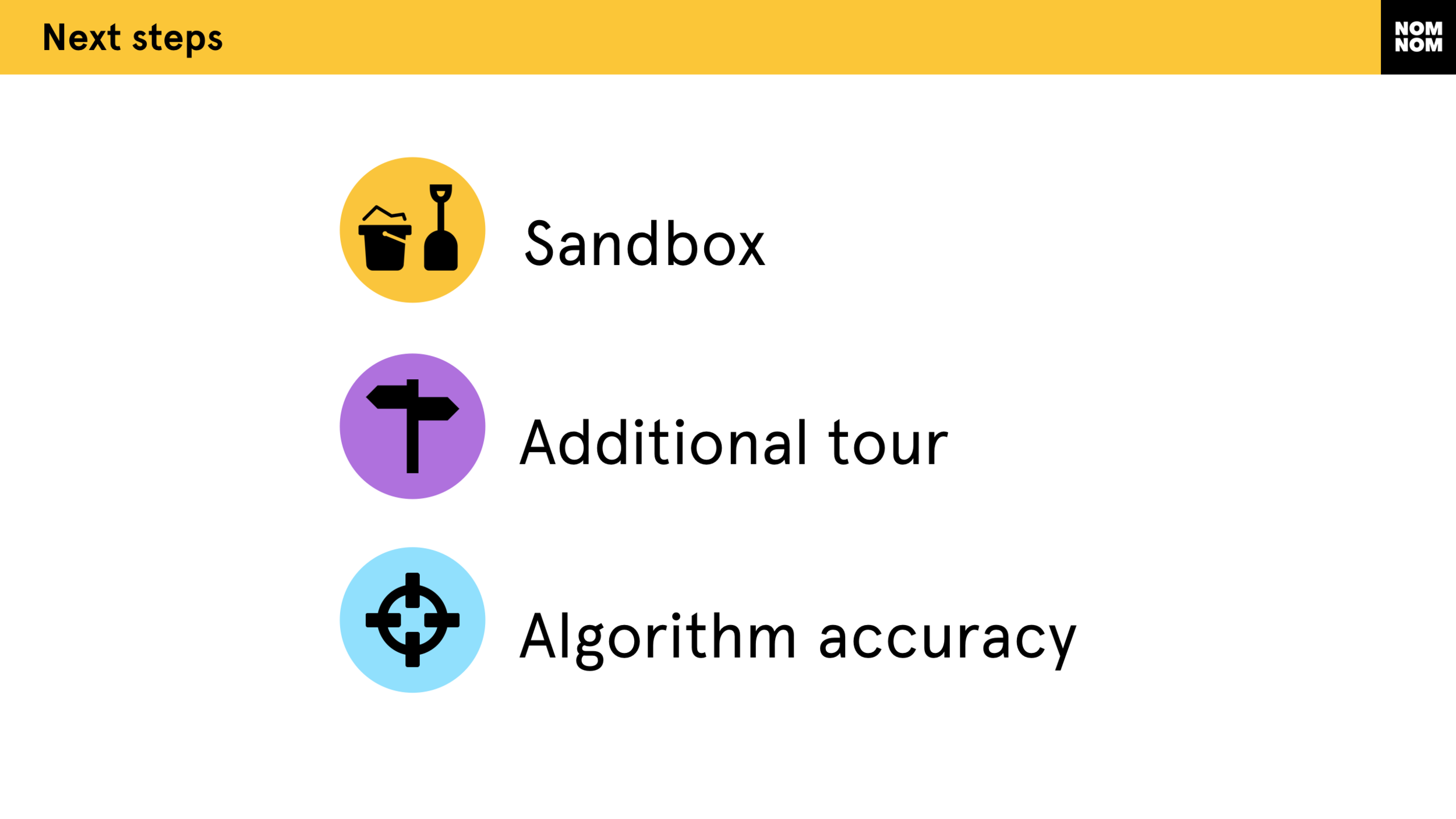
Ideas for future exploration
During our final testing we did get some feedback that would be interesting for NomNom to explore in future. Testers like Andy expressed a desire for a “play” environment, like a sandbox. These testers really do learn by doing and would benefit from "having a go" with dummy data. Testers like Zhang said they’d hope for tooltips throughout the product that they would turn off or on. They also expressed an interest in exploring additional short tours. Testers from larger organisations where large volumes of data would be imported into NomNom cited a desire for reassurance on the accuracy of the sentiment algorithm.

Explore other projects
WAITROSE MEALS
A concept project to create a meal planning microsite for Waitrose allowing customers to plan single and weekly meals, and then purchase the ingredients necessary directly from Waitrose.

SHARE A SHOW
A concept mobile movie app with a touch of class. Aimed at sophisticated cinema-lovers who want to make sure they watch movies together, this app allows users to tag and share movies of interest